BUSINESS CARDS
Early in my college career my coach approached me about making him a business card. It ended up looking a little something like this …
… Not horrible but definitely not great. As I revisited my work my senior year I knew I wanted to revise this project because I have improved greatly as a designer since then and my coaching staff and team means more than anything to me so I was determined to improve my original business card design.
REDESIGN

Typography
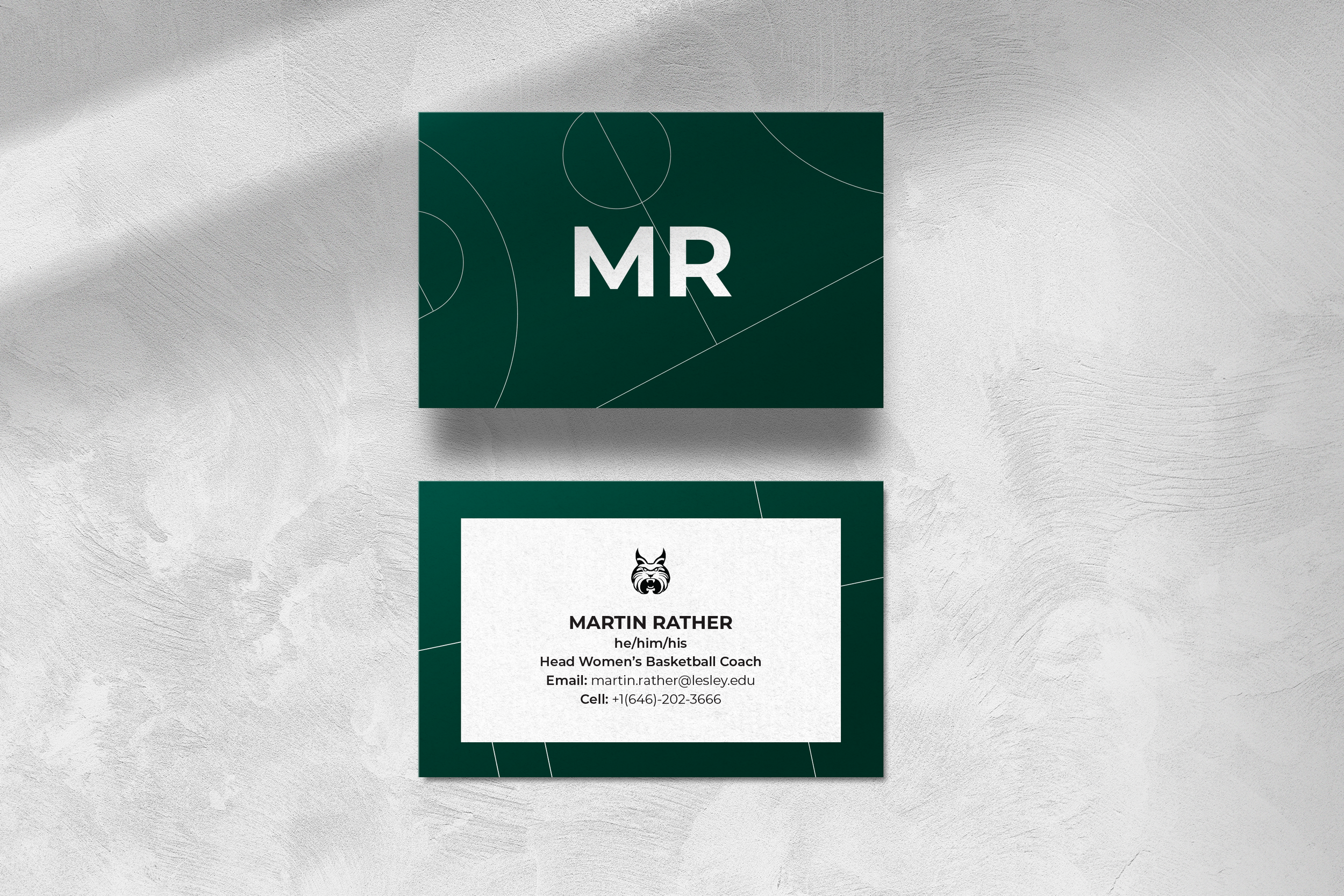
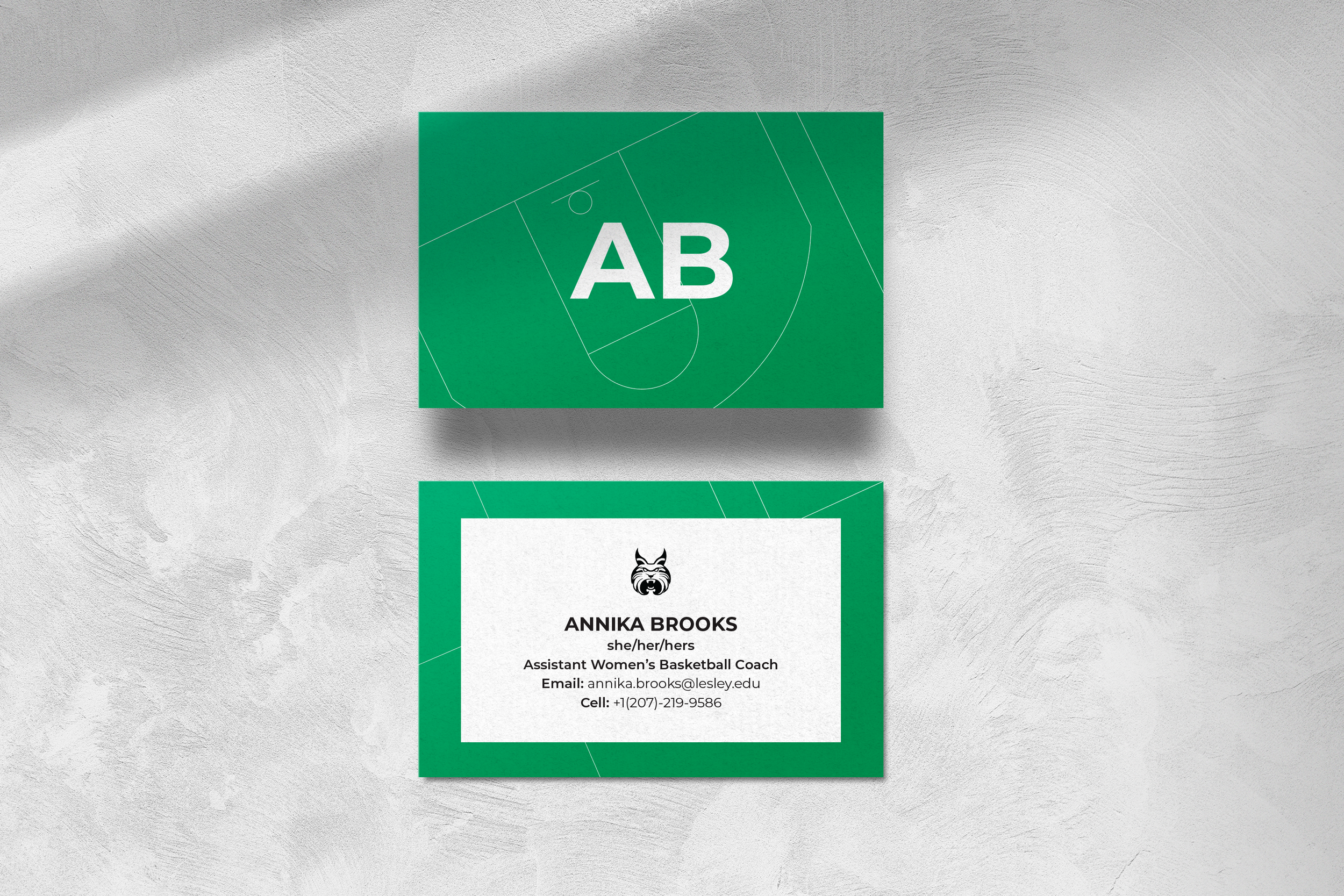
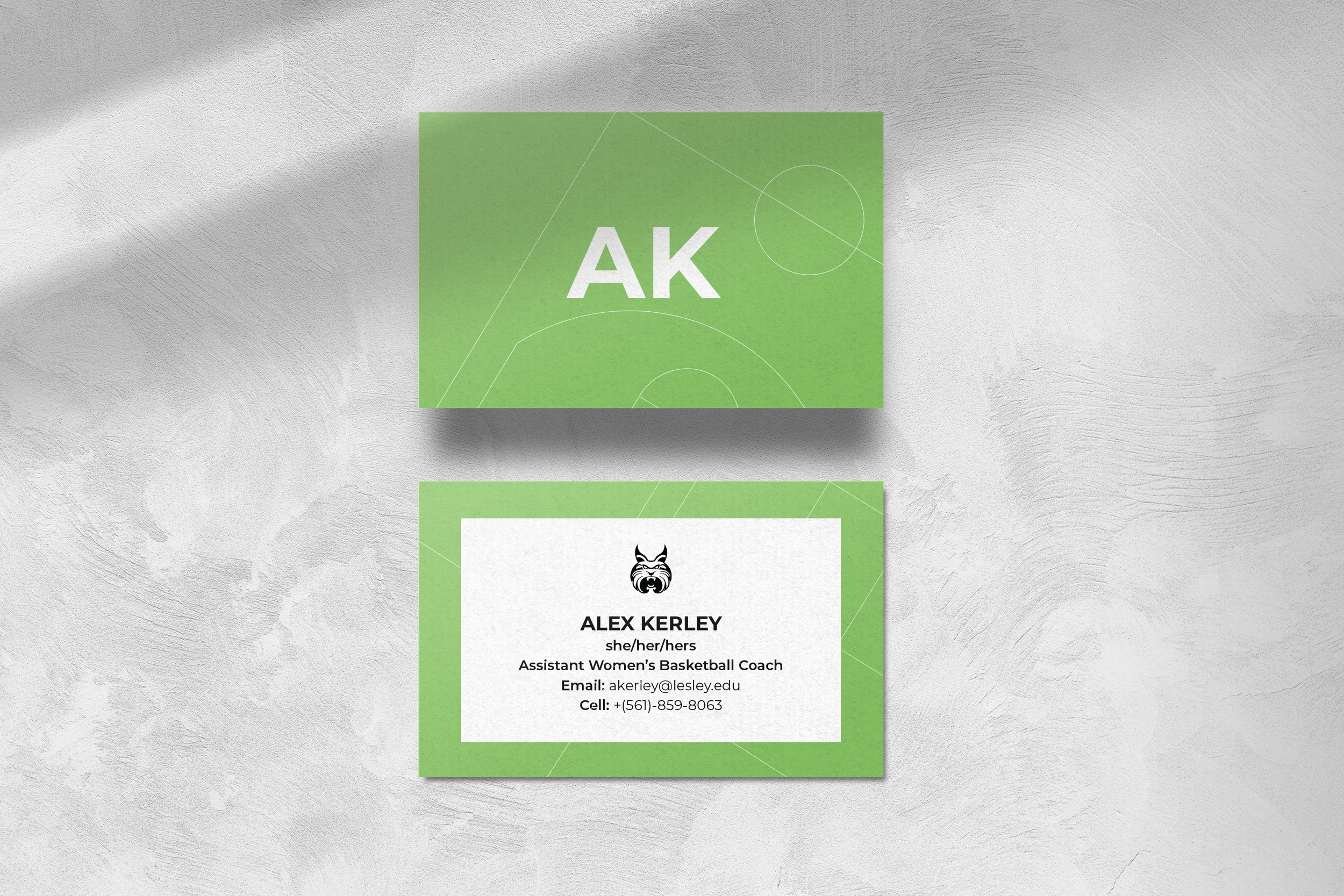
I selected the Montserrat typeface in Bold, Semibold, and Regular weights for its clean, modern aesthetic and strong legibility across digital and print formats. Montserrat's geometric structure and professional tone made it the perfect choice to reflect the forward-thinking, polished image of our program.
Color Palette
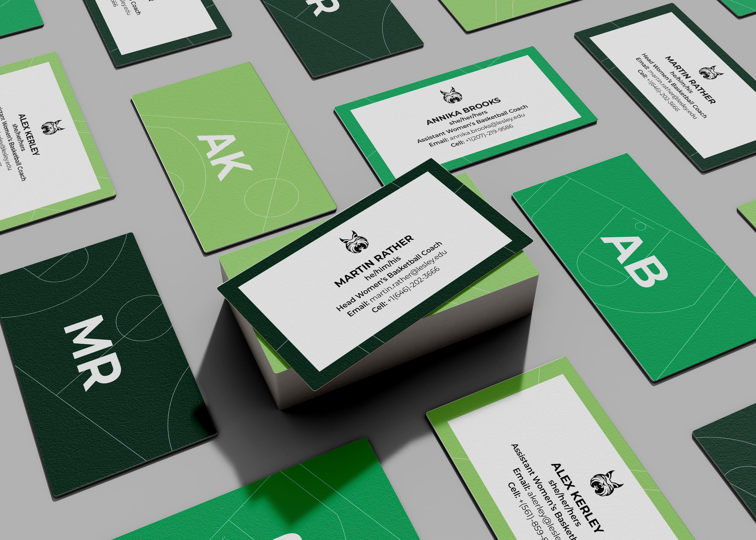
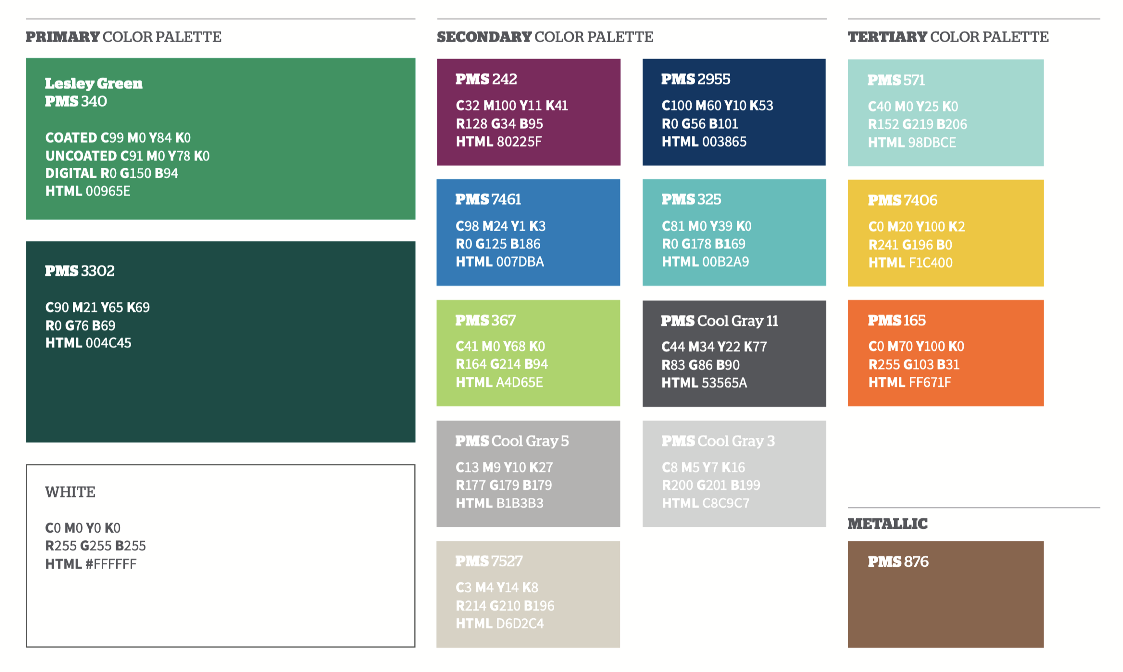
From the primary color palette, I used two green tones. One of them one being “Lesley Green” to showcase school pride and consistency in branding. A third green from the secondary palette was added to introduce subtle contrast and visual interest.
Design Elements
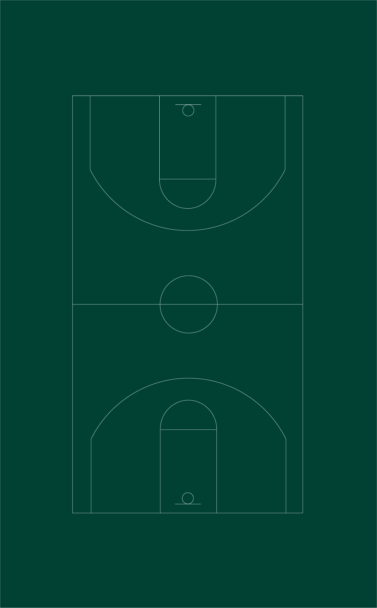
A thin white outline of a basketball court is woven into the layout, subtly breaking through each card in an abstract manner. This detail creates a sleek and sophisticated look, representing the refined yet dynamic nature of our team and coaching staff.