SOAP BRAND
HB naturals began as a spark during my sophomore year, when a class project challenged me to create a pattern inspired by a country. I chose Indian as my inspiration. That year I also created a series of three hand soaps. This year, I brought the two ideas all together by launching a full soap brand inspired by the vibrant colors, patterns, and natural elements of India. Rooted in sustainability and self-care, HB naturals celebrates cultural beauty through clean ingredients, bold scents, and thoughtfully designed packaging. This has become one of my most robust and extensive projects compiled of over two years worth of exploration and expansion.
Abstracting India
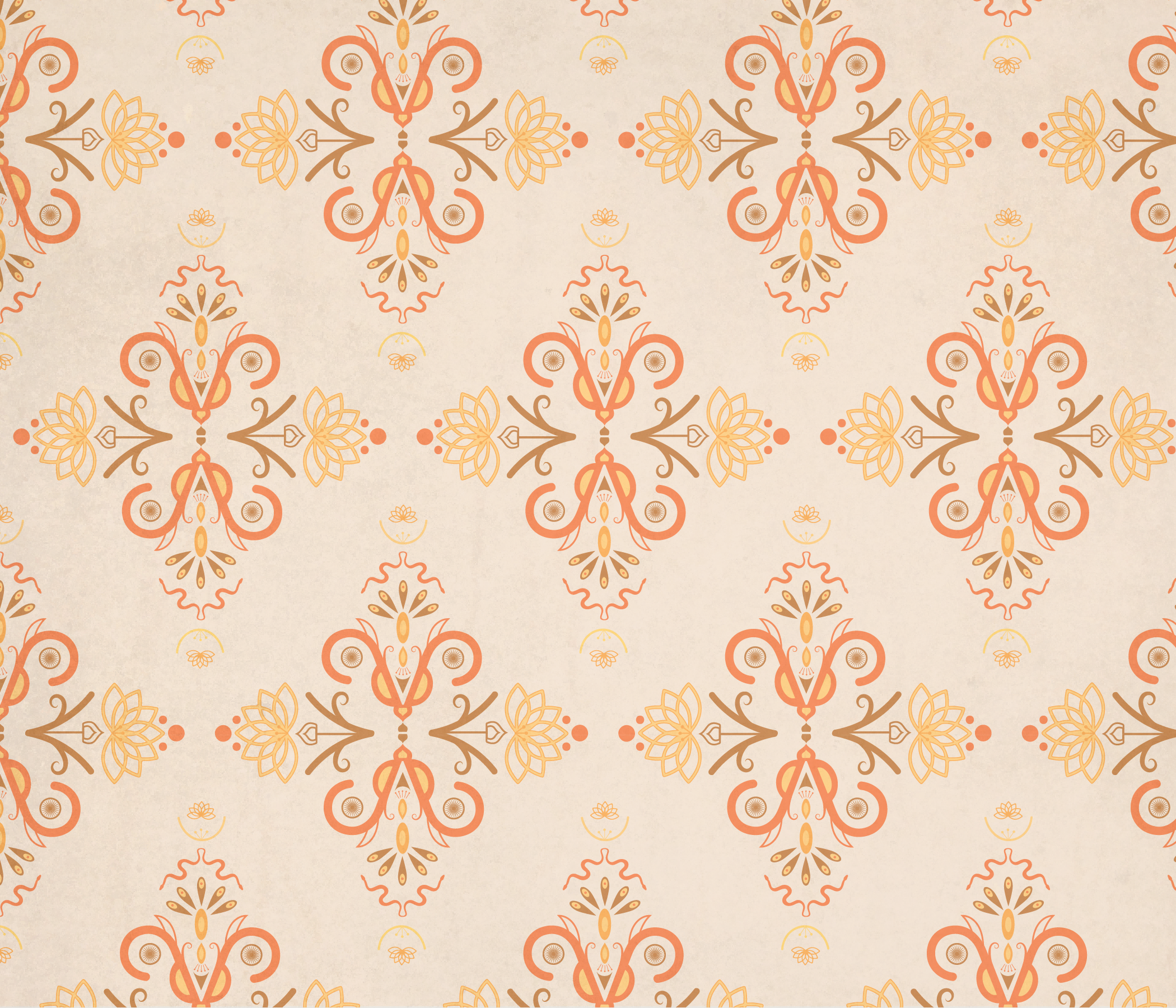
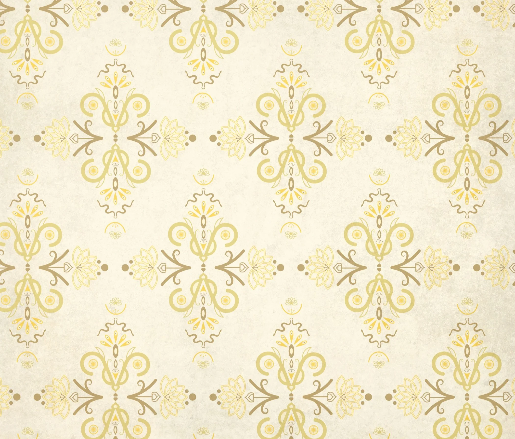
My initial journey with this soap brand started when I created a series of patterns called “Abstracting India” in my surface design class. I did research on India and learned about the country’s flag, native animals, national flower, architecture, and gained inspiration from colors and patterns along the way.
that lead me to create this…
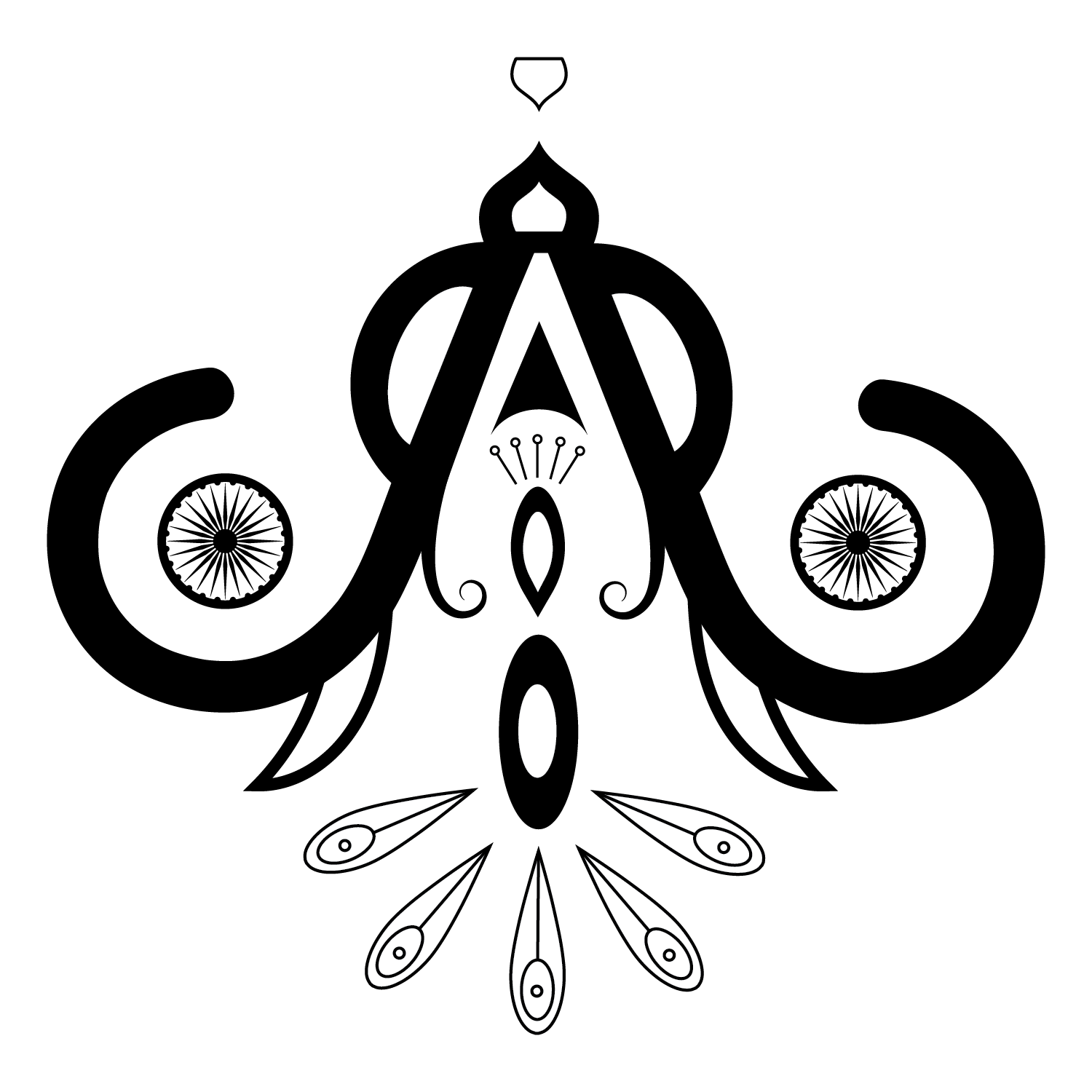
I used the top of the Taj Mahal to top this design. I added the trunks and tusks of the side profile of an elephant mirroring one another and adding beautiful symmetry to the piece. I abstracted elements from a peacock in particular their showy tails that sits tucked nicely in the middle of my abstracted elephant heads . Lastly, I’ve included the symbol from the country’s flag that’s encompassed by the elephant’s trunk on each side.
my original pattern…
This was my first ever time making patterns in Illustrator and it was an amazing growing experience and I truly enjoyed the process. I added in some lotus flowers and organic plant like shapes to fill in the negative space that was created when I made the pattern. I also added in some snakes to fill in the other space which helped add a bit of life and movement to the pattern.
Then came my soap project…
Hill’s Handcrafted
This soap brand was my first time doing a mockup and helped me develop branding skills. hill’s handcrafted and Abstracting India offered a great foundation and amazing combination to create HB naturals.
combining the two…
HB naturals
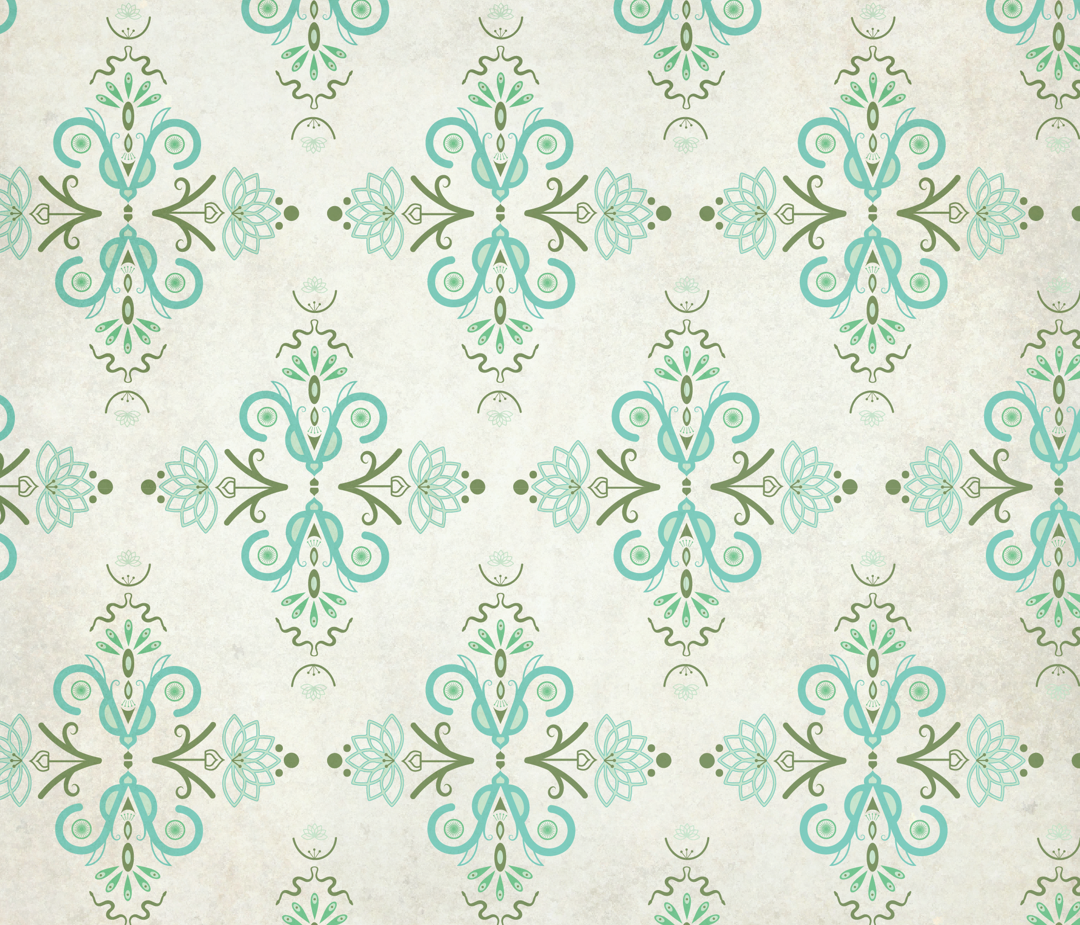
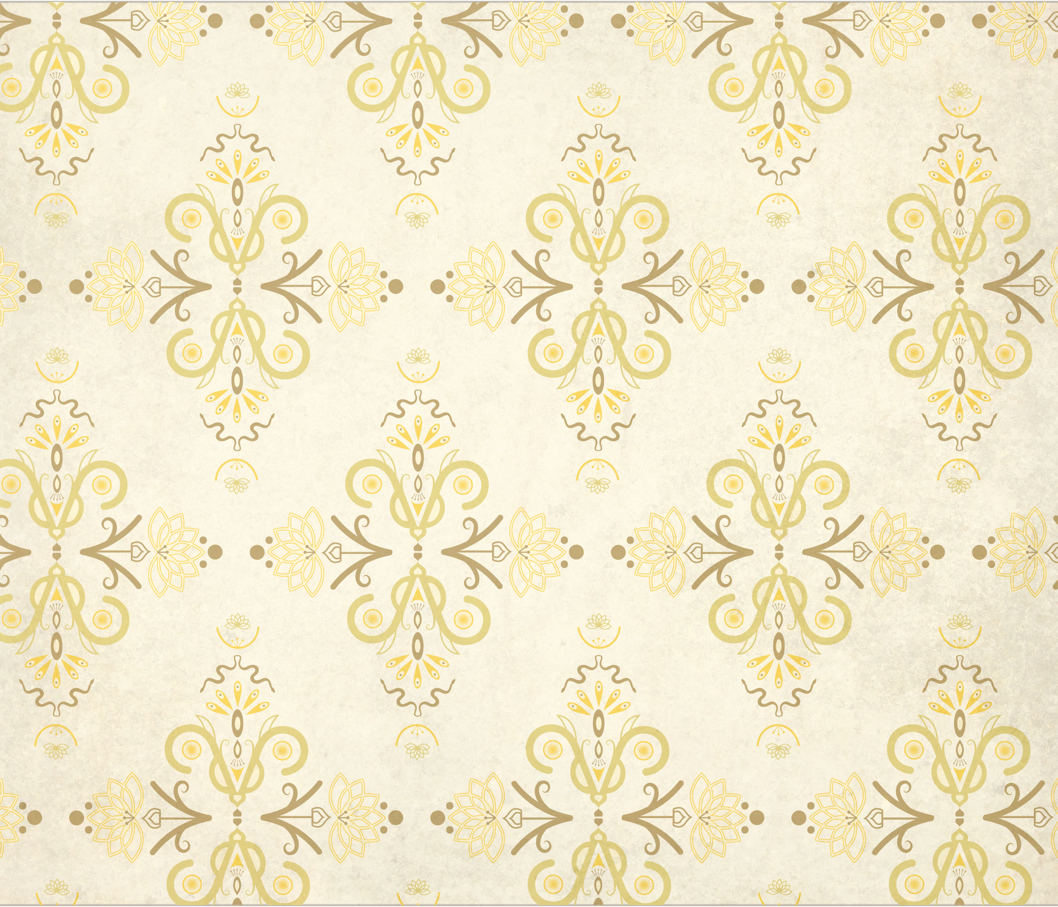
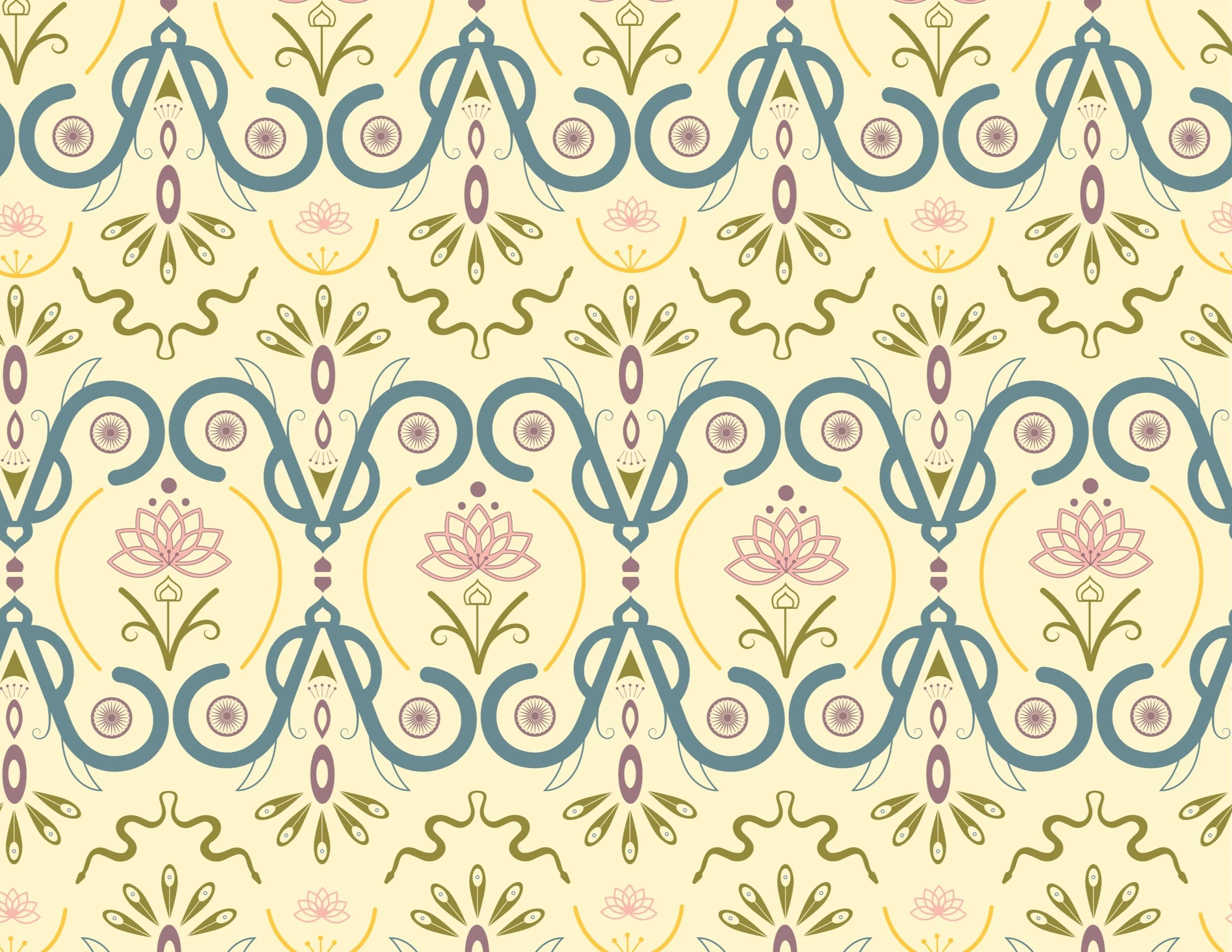
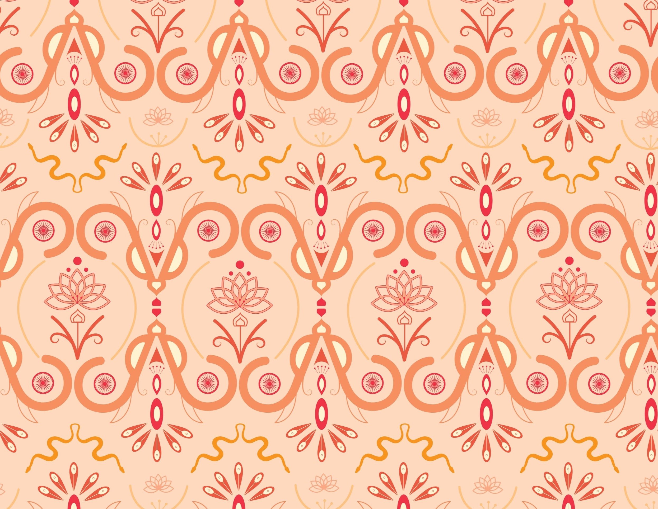
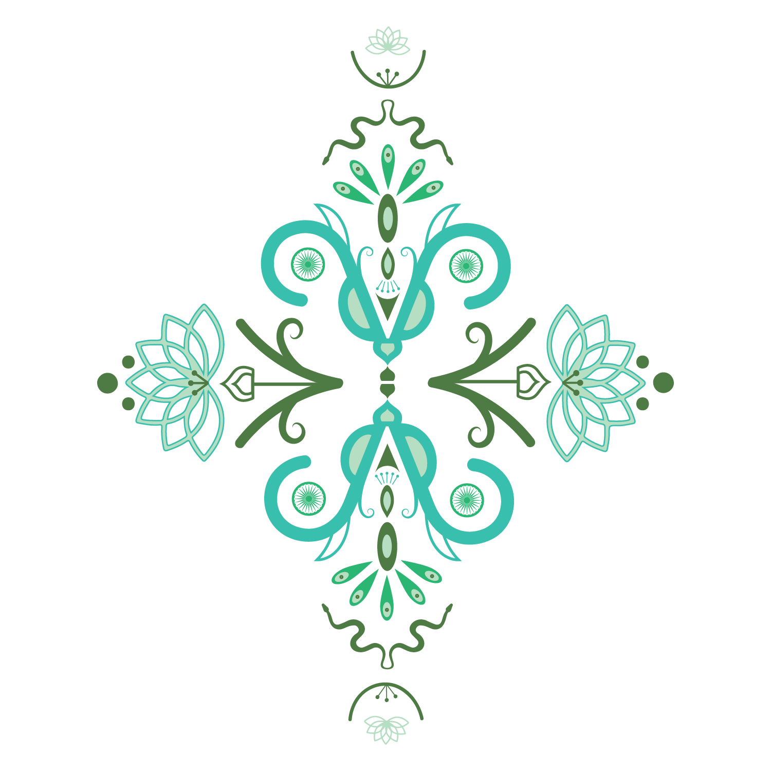
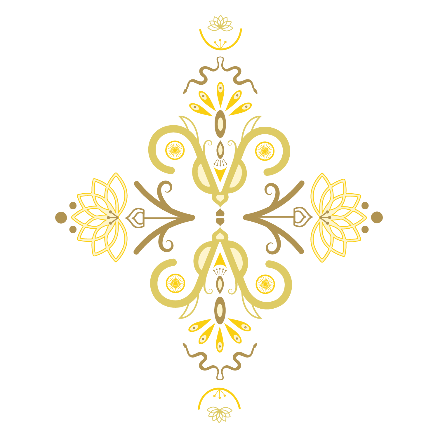
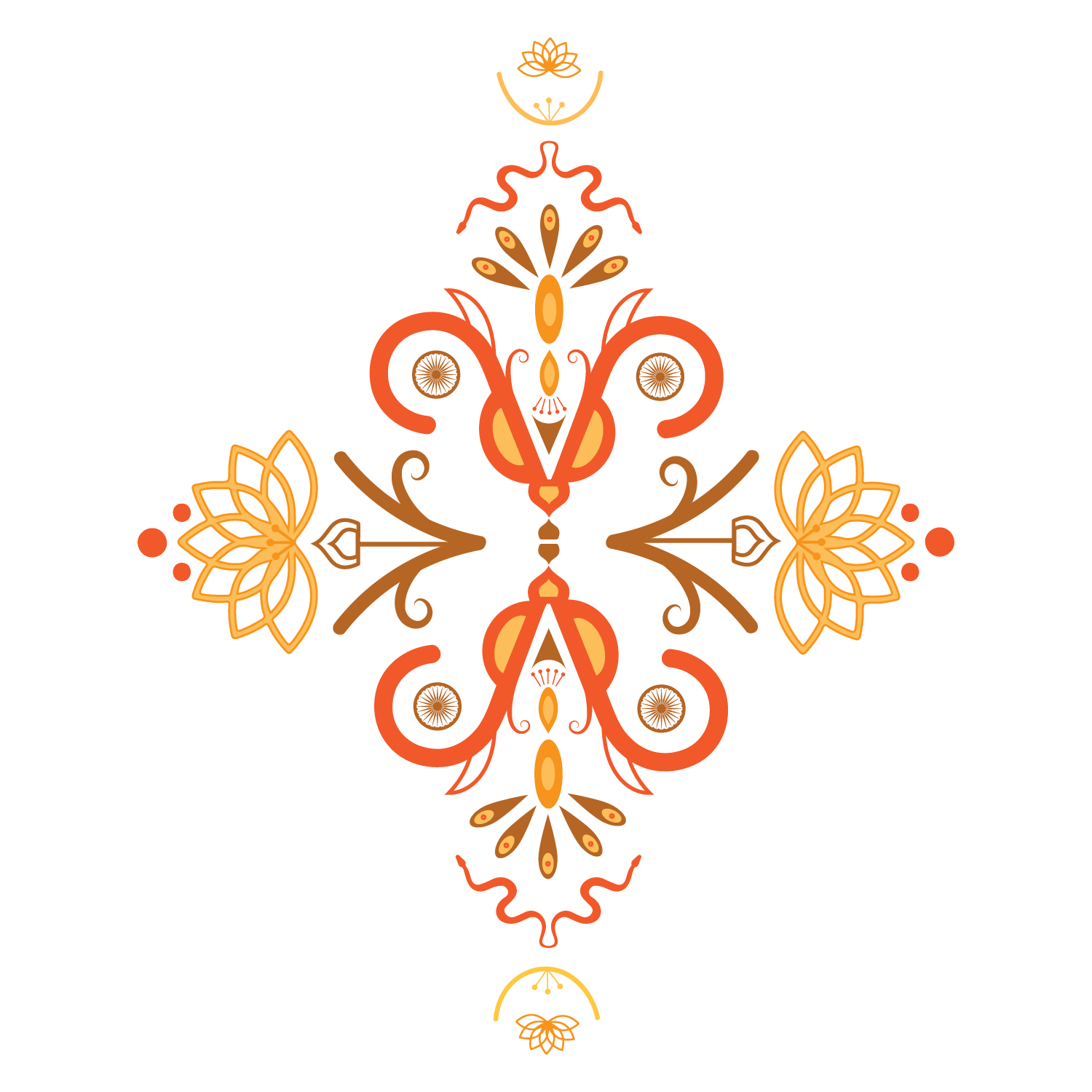
My hybrid project began by me revisiting my first initial mark for my India inspired pattern. Since this was going to be a brand with different scents I knew I had to make three different versions. I chose four colors for each color palette to reflect the different scents I was going to have.


Transforming into Patterns, Labels, and Logo
I wanted the new patterns to be loud and bold yet still sophisticated and organized with some breathing room. I also added some texture for a bit more life and character.


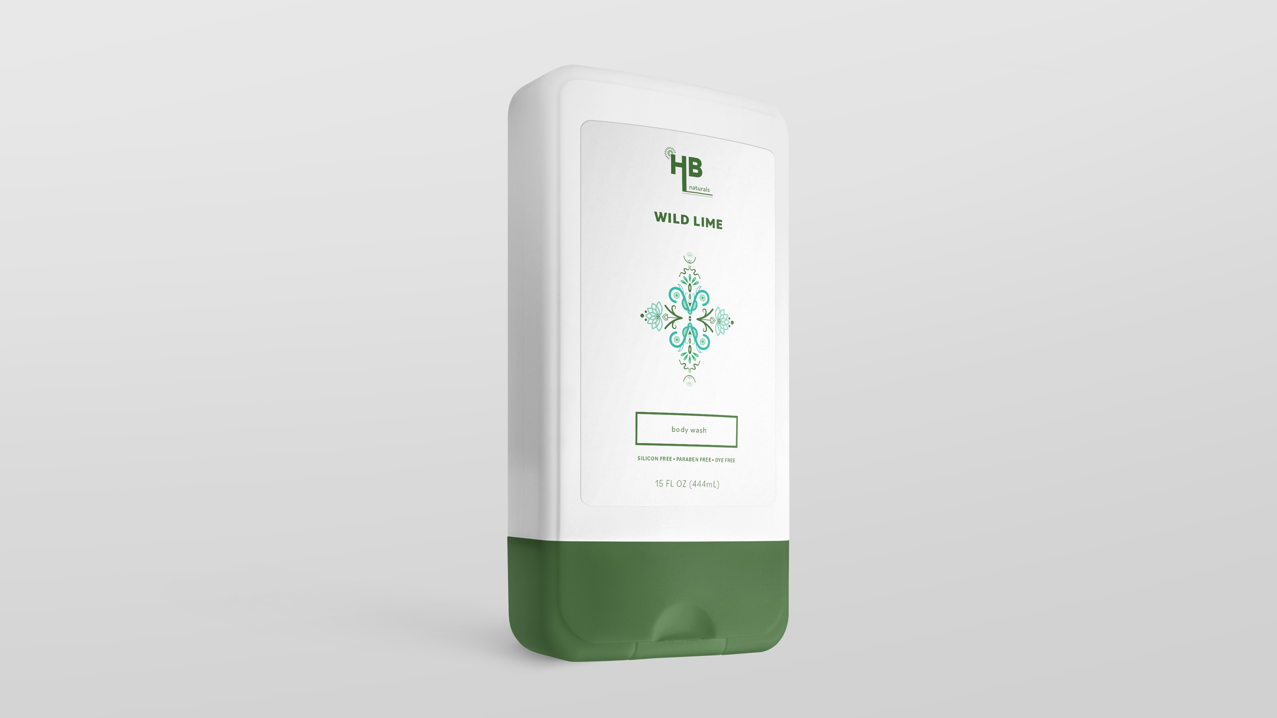
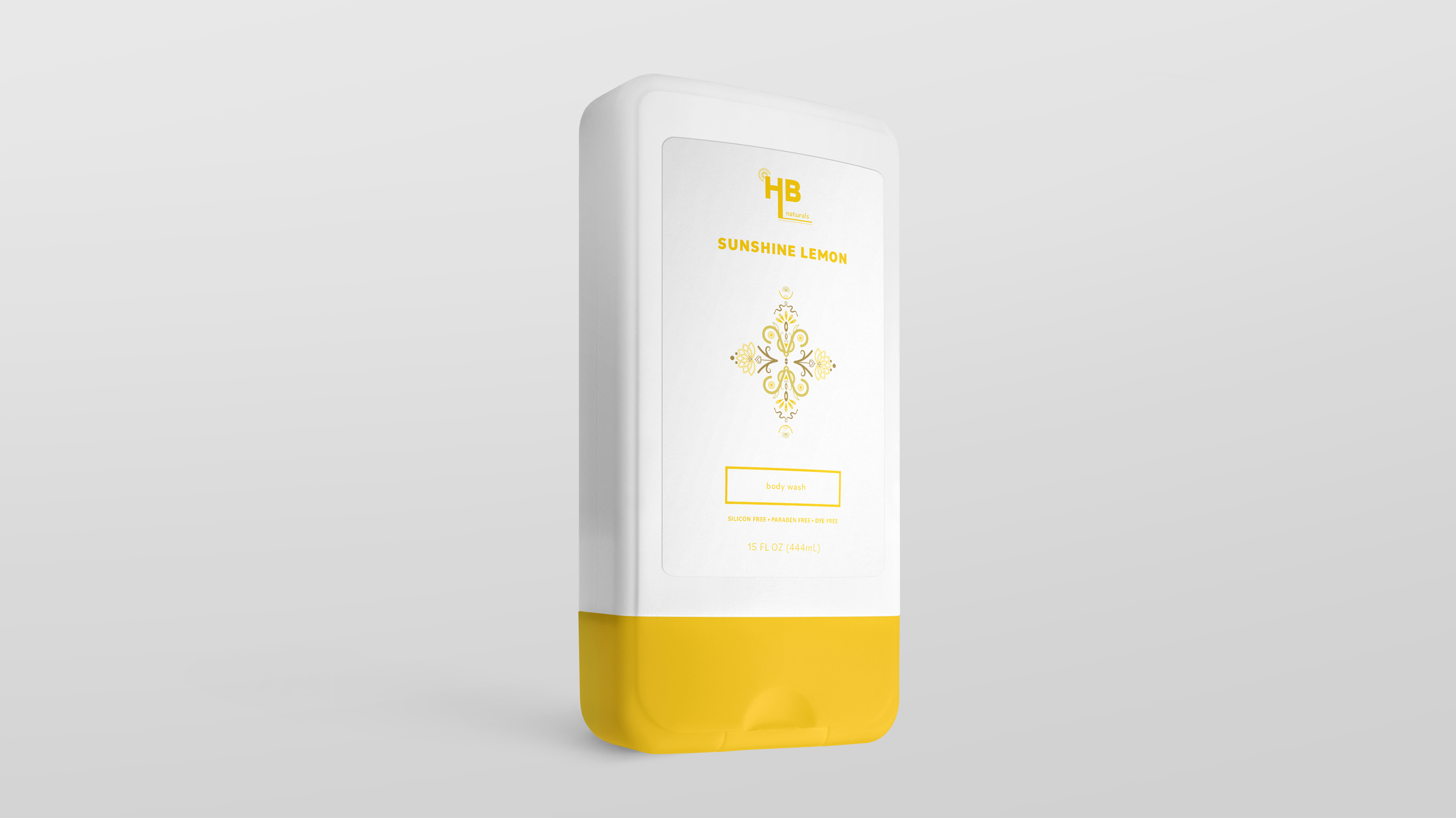
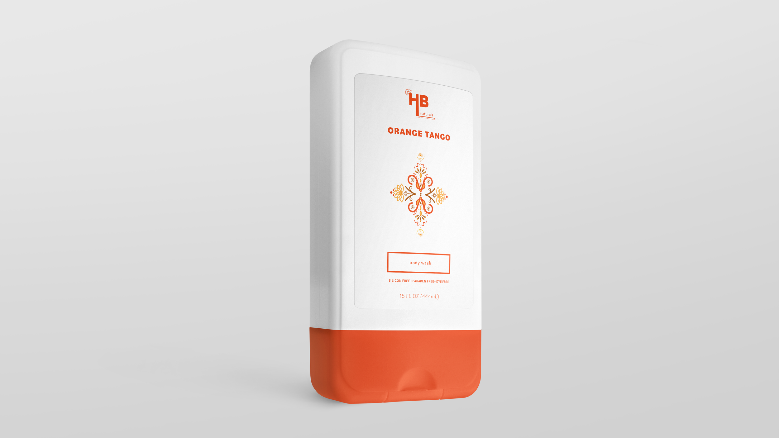
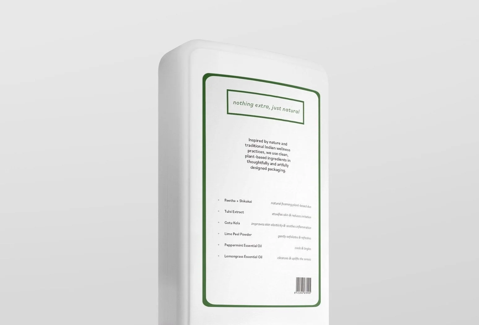
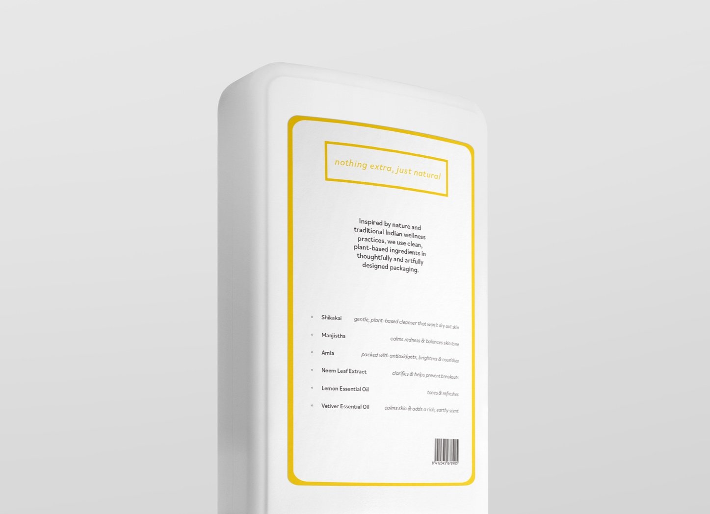
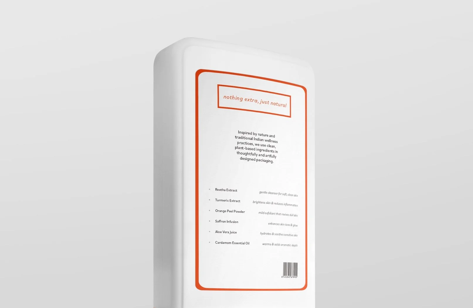
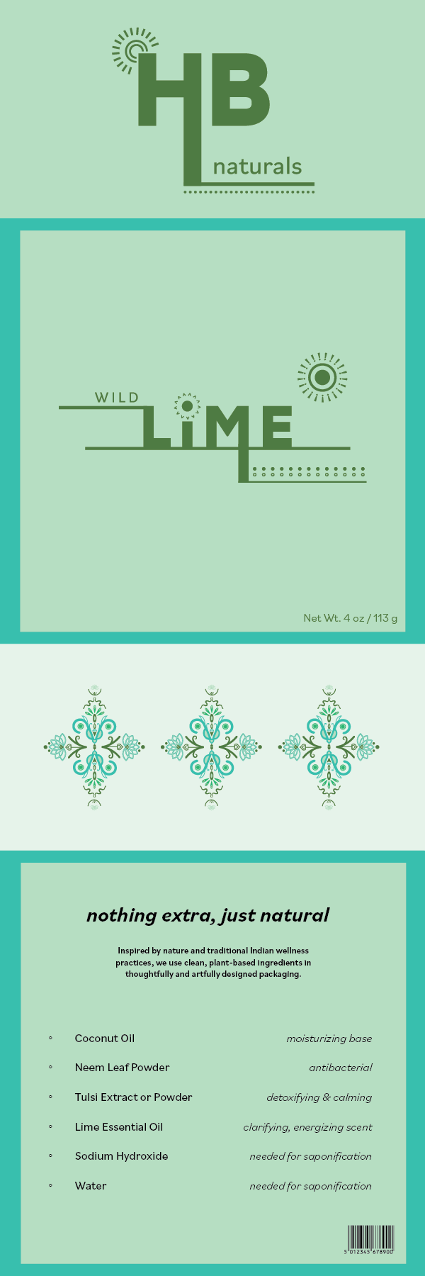
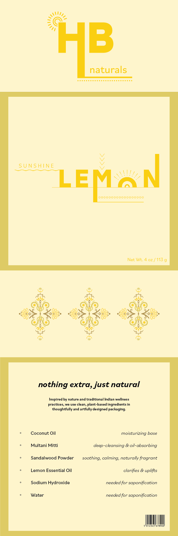
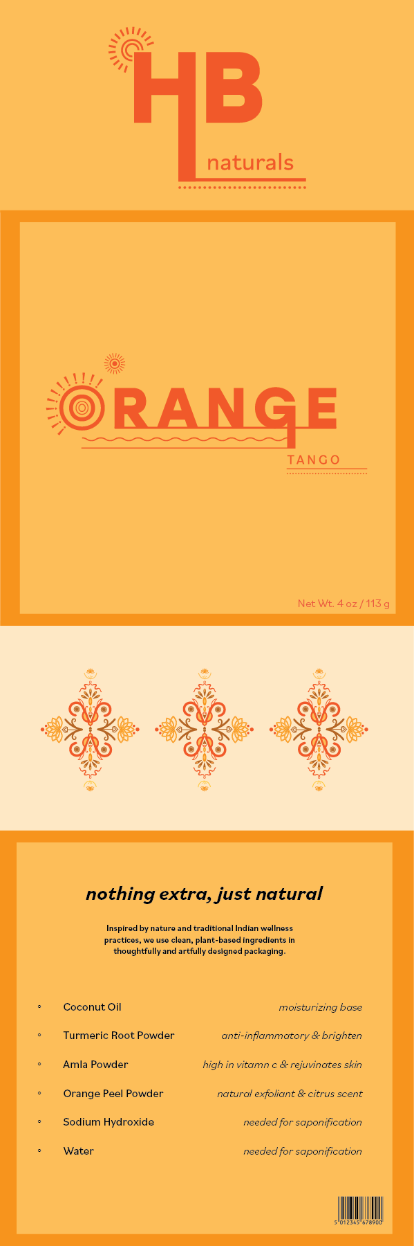
I then began reworking the original soap labels, aiming for a clean design that reflected my simple, natural ingredients while adding a fun, vibrant touch inspired by the rich cultural elements of India that I had researched and drawn from.
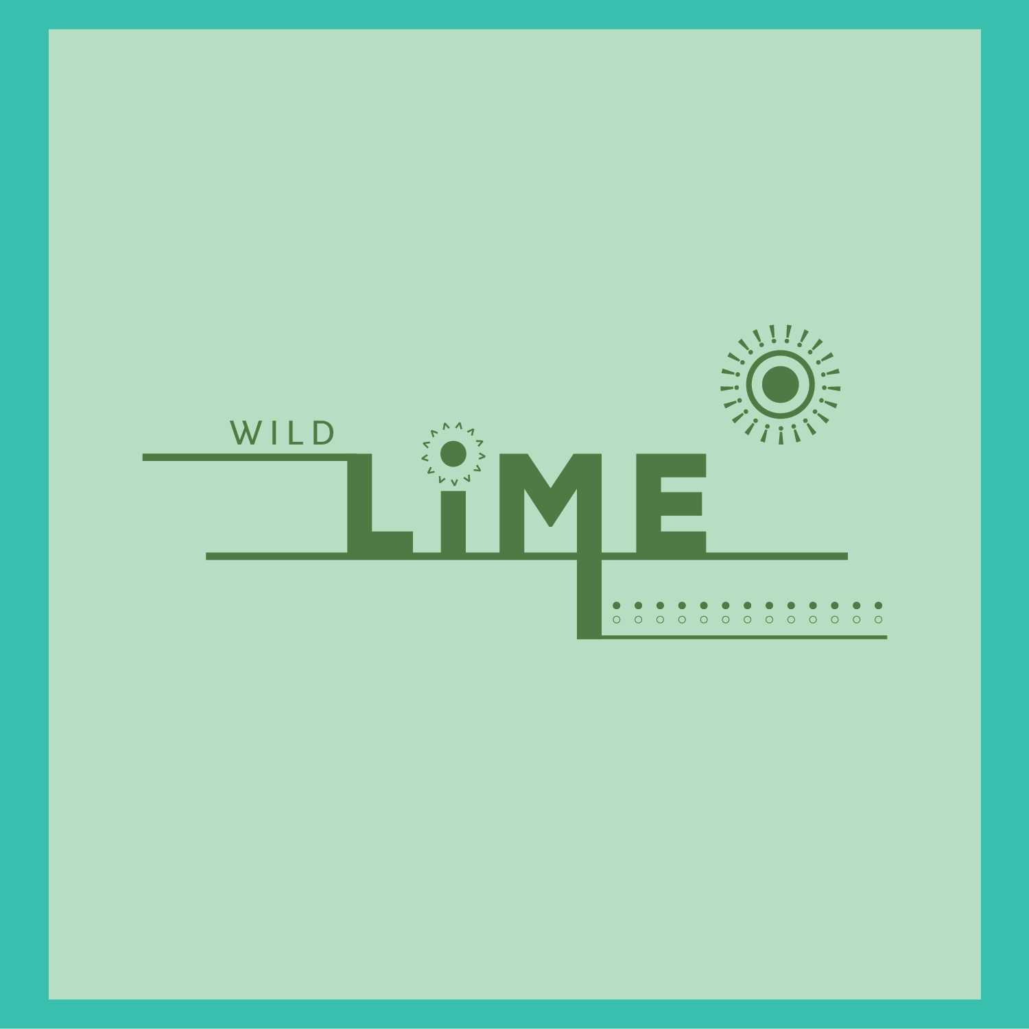
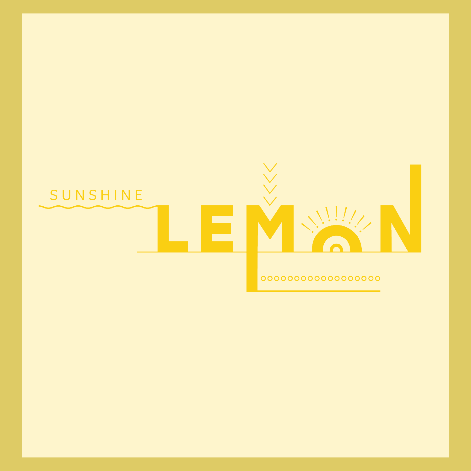
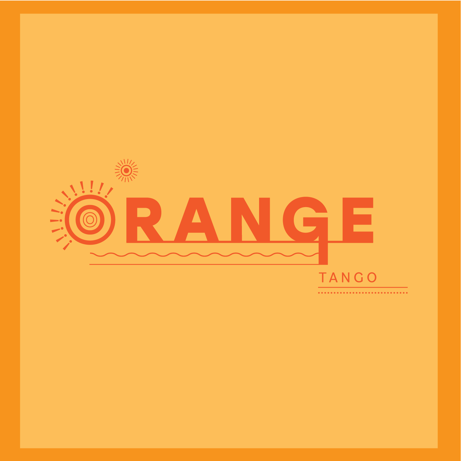
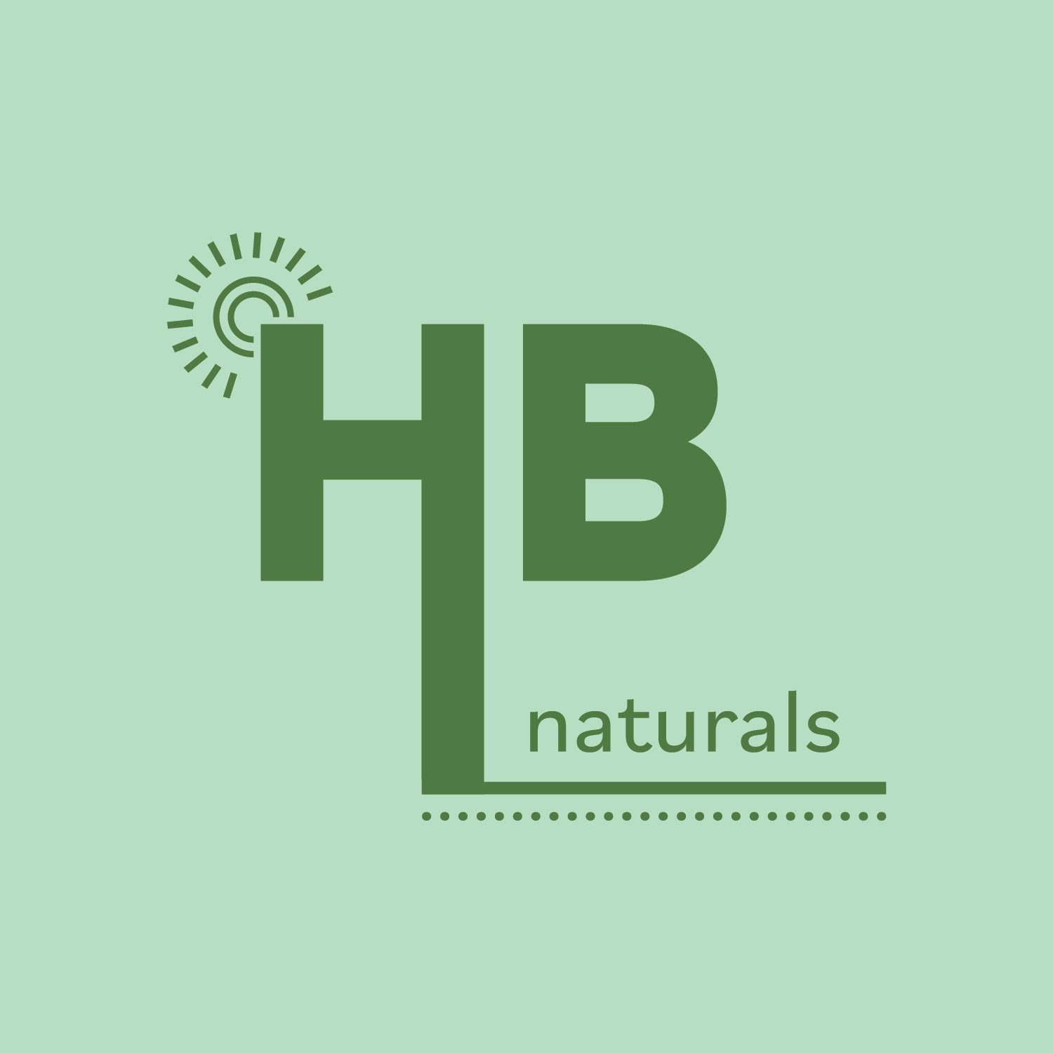
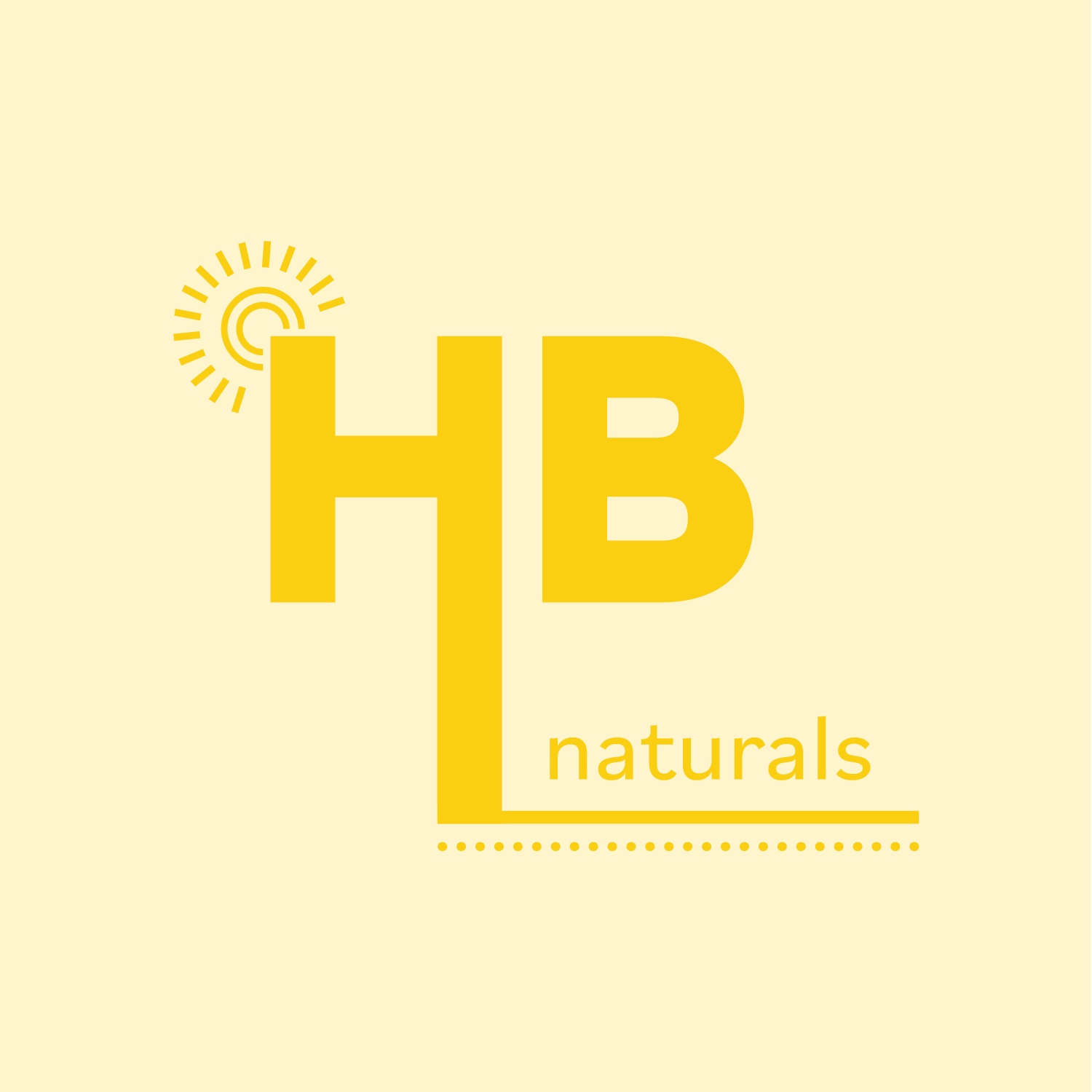
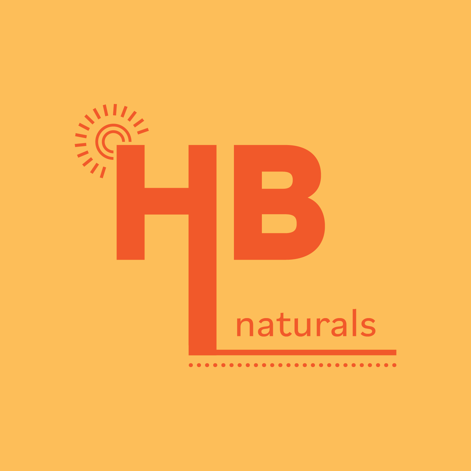
The HB Naturals logo combines bold, structured typography with warm, earthy tones to reflect both strength and simplicity. The extended lines and dotted underline add a handcrafted, playful feel, while the sunburst detail hints at energy, warmth, and wellness. It’s clean, intentional, and rooted in natural beauty like the brand.
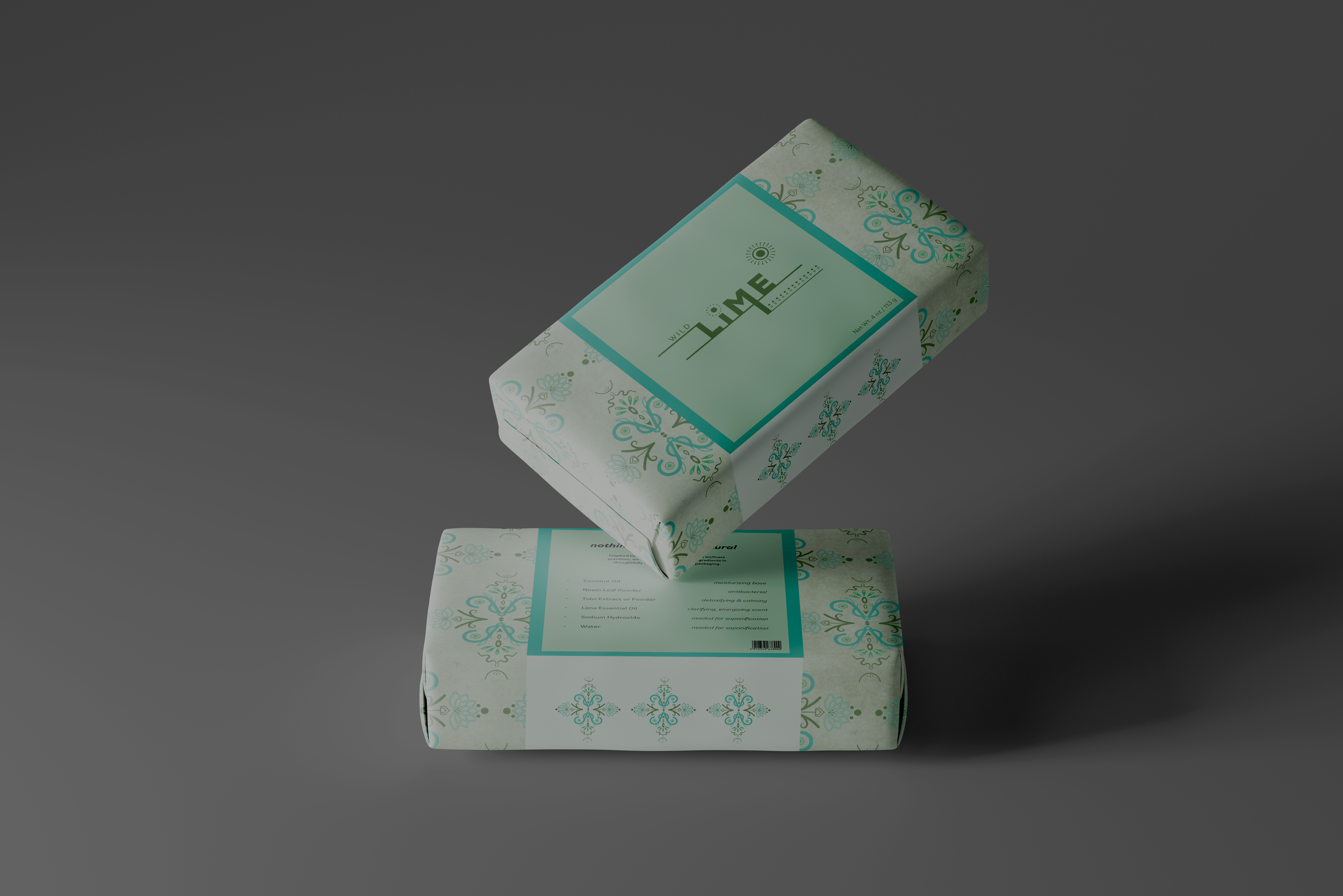
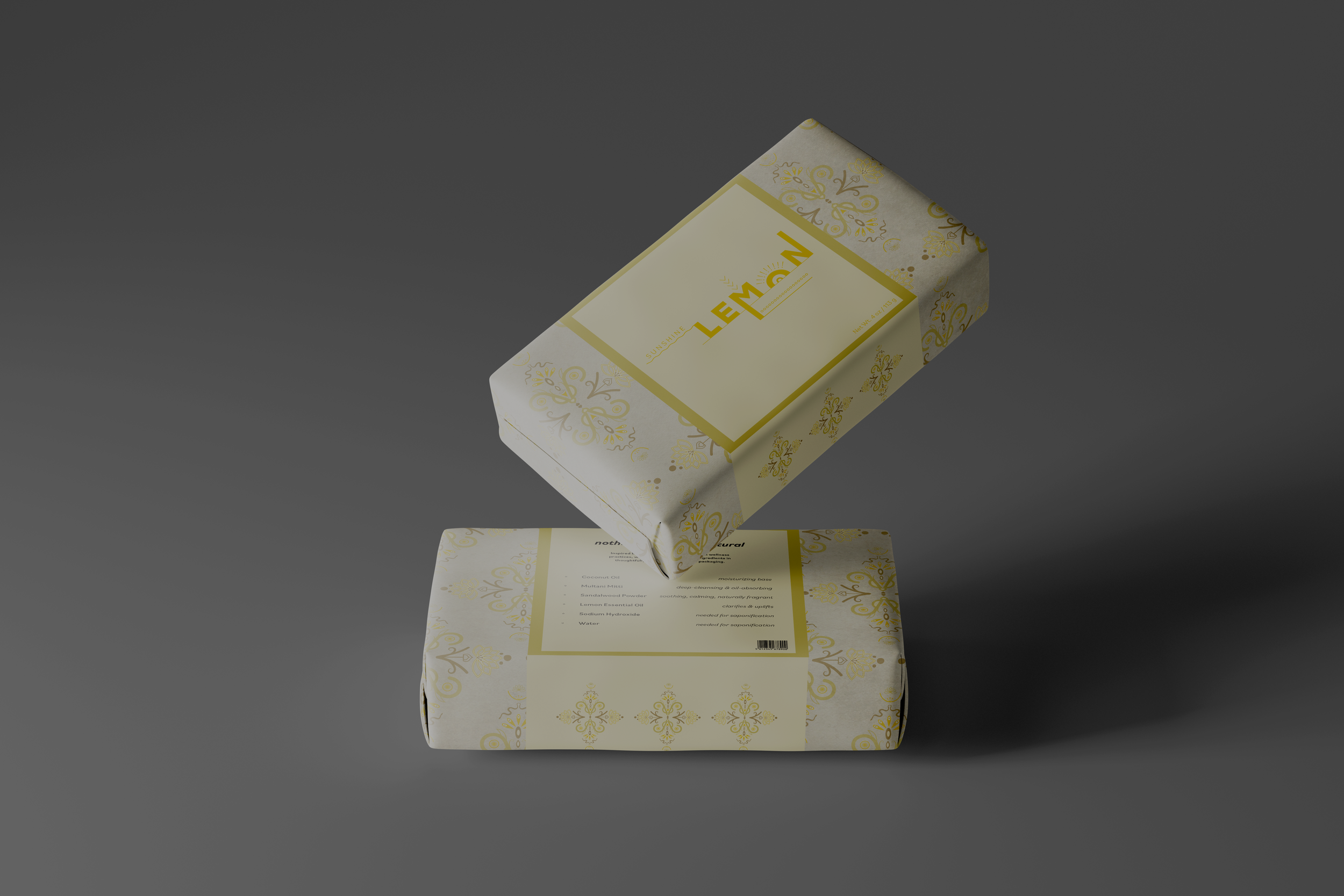
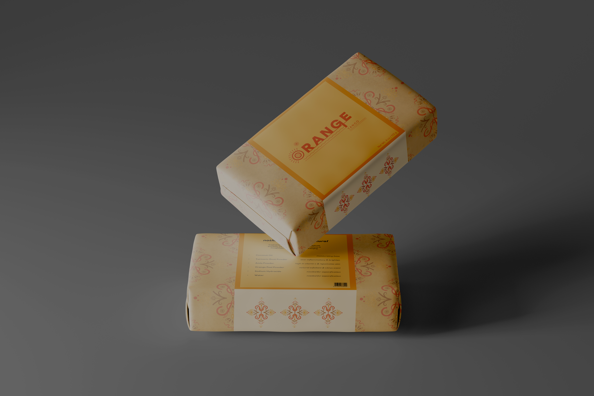
I then combined the two and made these sleeves that I would wrap around the center of the soap bars to overlap with the “wrapping paper” I made out of the new pattern.
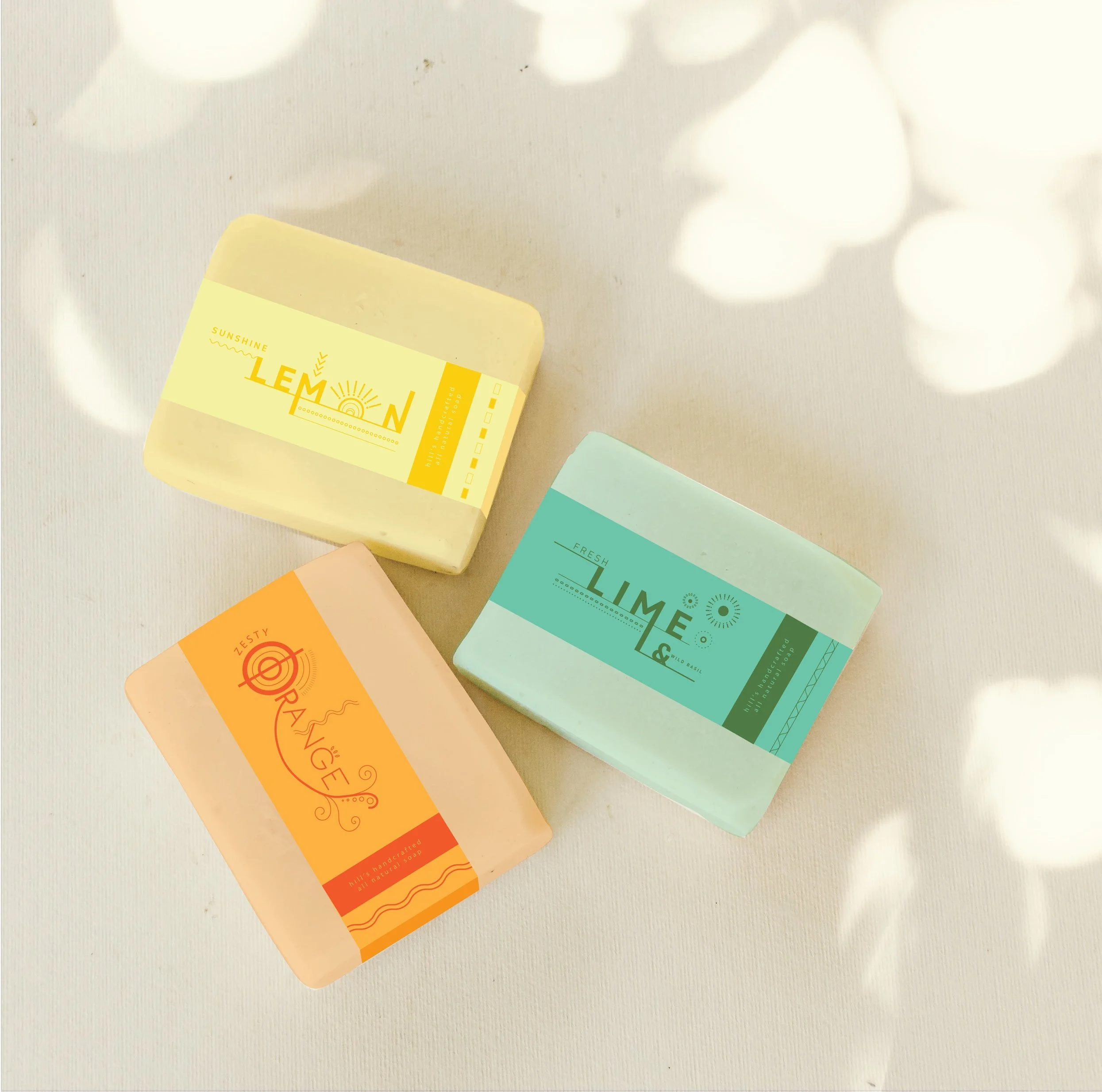
MOCKUPS
Hand Bar Soap
Here we see my vision come to life in this mockup that features the soap fully wrapped in each pattern that coordinates with each scent. Then we can see how the sleeve beautifully overlays on the center of the bar.
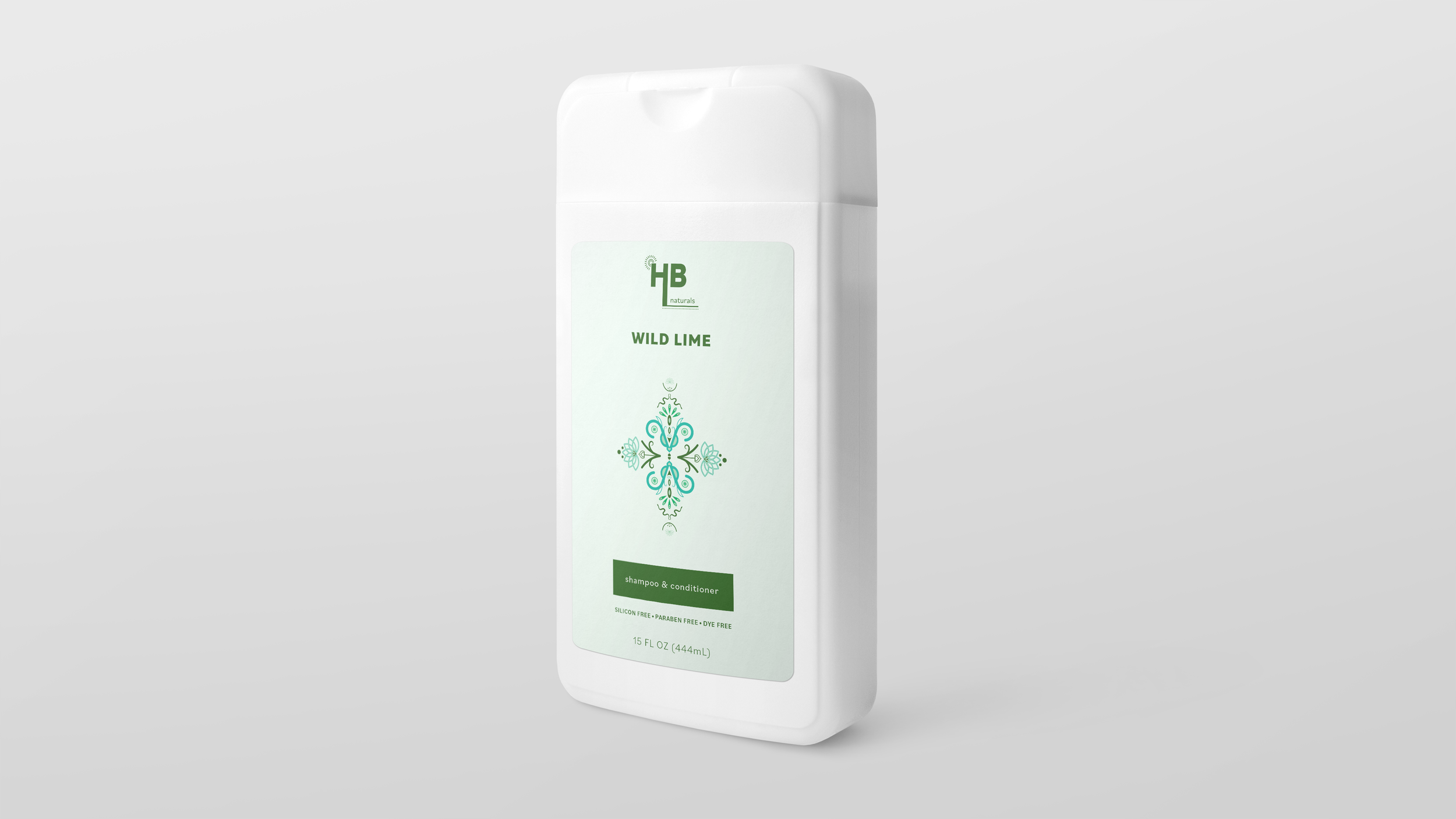
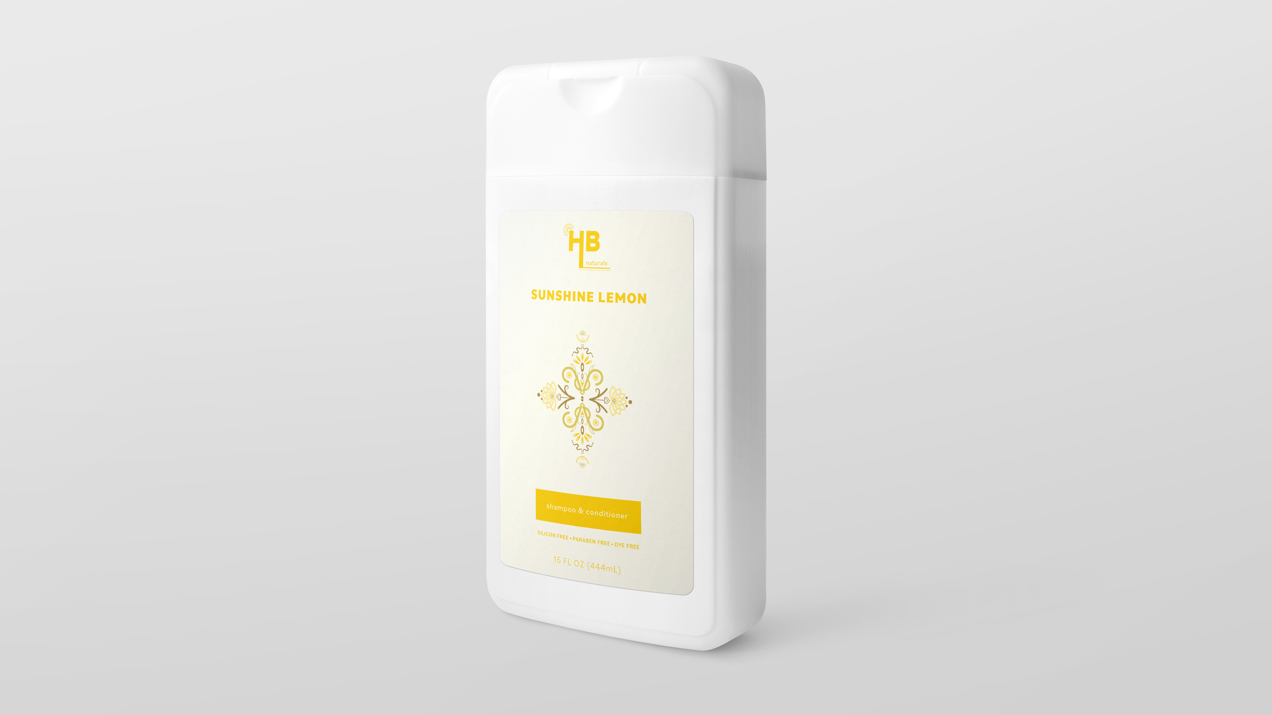
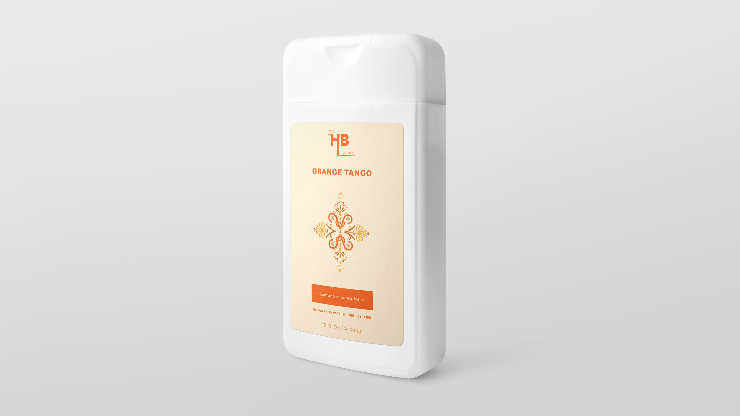
Shampoo & Conditioner
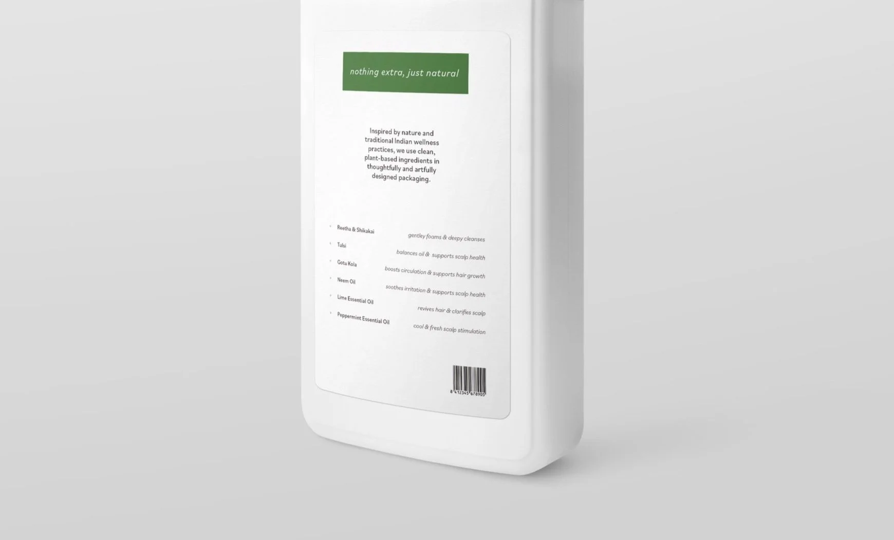
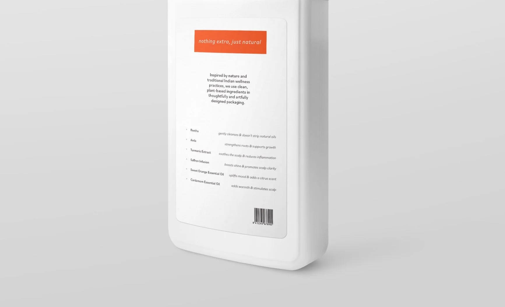
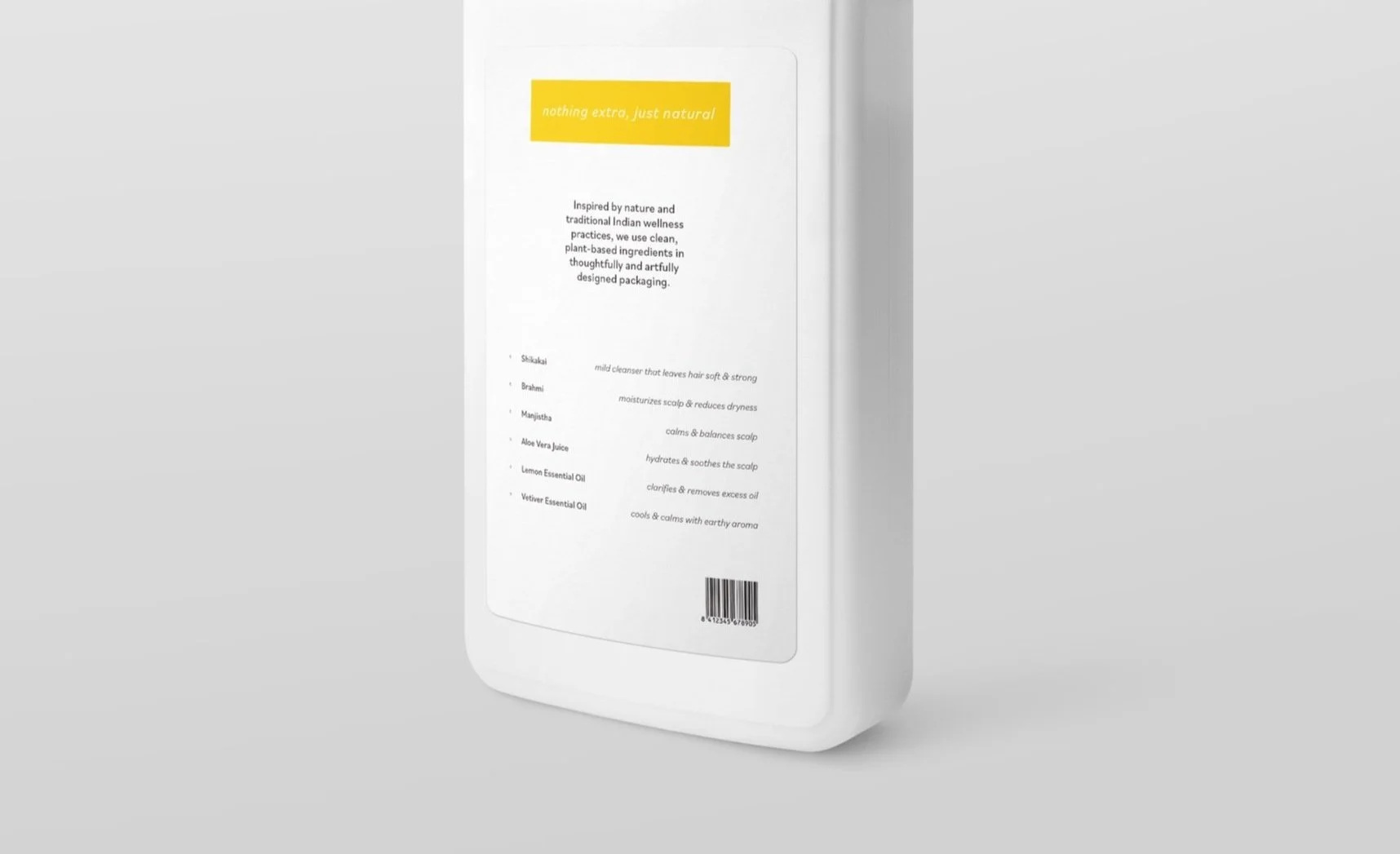
My shampoo and conditioner bottles are simple, clean, and sophisticated with natural ingredients and an easy to digest ingredients list that doesn’t just list the ingredients but tells their purpose. To differentiate the 2 in 1 from the body wash I added a light color to the background of the front label and the cap is at the top of the bottle.
Body Wash
Lastly, we have my body wash which differentiate themselves by celebrating white and a lot of negative space on the bottle but has a bold cap and upside down orientation so it will not be mistaken for the 2 in 1 but stays on brand with the rest of the products.